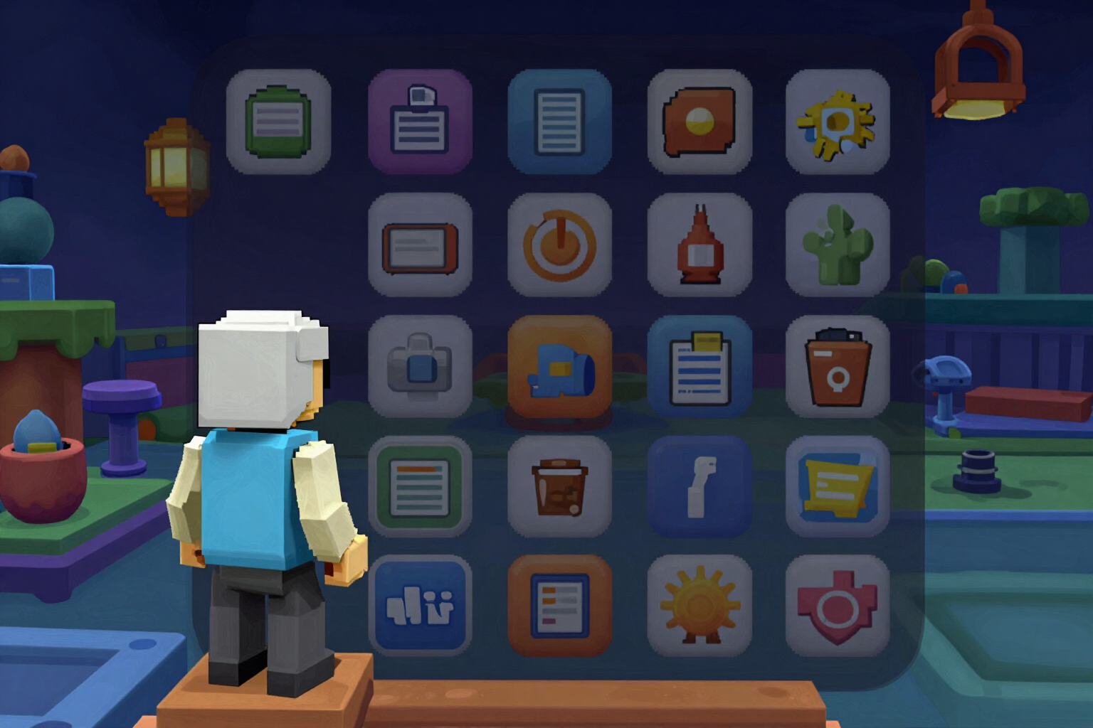
This is what your Roblox icon will look like on mobile before uploading
Place your icon in a discovery grid with real proportions and see it truly downscaled to 64 pixels, the size a player sees on their phone.
You design your icon at 512×512 on a large screen. The player sees it at 64 pixels, surrounded by eight other icons competing for the same touch. These are two distinct images, and almost no one tests the second one.
The Roblox mobile feed simulator takes the icon you just generated and places it within a three-column discovery grid with the real proportions and density of a mobile listing: eight neighboring icons around yours, with their two lines of title below. It is not the Roblox interface nor does it imitate it: it is a generic grid with the app's aesthetic, because what matters here are the proportions, not the decoration.
The difference lies in how the image is downscaled. The app does not apply a browser transform: scale, which smooths the edges and deceives you by showing a cleaner icon than the player will see. The server generates real downscales with sharp at 48, 64, and 72 pixels, and the simulator displays the reference, 64 pixels, rendered without interpolation. What you see is exactly the information that survives at the small size: the silhouette that remains and the detail that turns to mush.
The simulator includes the legibility verdict, calculated pixel by pixel and without AI: global contrast, figure against background, detail density, and actual text height at feed size. If something doesn't hold up, you don’t have to close anything: the Regenerate with more contrast button requeues that piece from the simulator itself. And you can toggle between Mobile and PC to see the jump between the 64 pixels of the phone and the full-size desktop icon.
It fills a gap that no one covers, including Roblox: the Creator Dashboard allows for A/B testing of thumbnails, but not of icons. This app is an independent tool from AiToolsForApps and is not affiliated with Roblox Corporation.
Try Mobile feed simulator right here
Use it free without an account. If you want to save your result, you can sign up afterwards.
Save / Sign upBenefits of Mobile feed simulator
Real downscale, not a CSS scale
the thumbnails at 48, 64, and 72 pixels are calculated by the server with sharp and rendered without interpolation, so it doesn’t show you a cleaner icon than the player will see.
Discovery grid with real proportions
three columns, eight neighboring icons, and two lines of title underneath each, so you can compare your icon in context rather than isolated on a white background.
At 64 pixels, the reference size for mobile listings
the test that truly determines if your silhouette stands out from a thumb's distance.
Highlight your icon with a touch
a pulsing ring indicates which one is yours within the grid, to see if it stands out or gets lost among neighbors.
Legibility verdict included
global contrast, figure against background, detail density, and actual text height, measured pixel by pixel, without AI and always reproducible.
Mobile / PC comparison at a touch
the same icon at 64 pixels and full size, side by side in time, to see how much it loses along the way.
Redo the piece without leaving the test
if the icon doesn't hold up at small size, Regenerate with more contrast queues it from the simulator itself.
Notice before generating
if your highlighted text exceeds 22 characters, the app warns you that at 64 pixels it will be just readable, instead of letting you discover it at the end.
Check if your icon holds up on mobile
Generate a 512×512 icon, open it in the feed simulator, and see what the player will see at 64 pixels. Works without registration.
In the features that use AI, responses are generated by artificial intelligence and are not a substitute for professional advice.