Thumbnail test with measured traffic-light verdict: the verdict is not given by eye
Each finished cover goes through three measurements on the actual file —contrast under the title, stroke weight projected at 60 pixels, and word count— and the traffic-light tells you green, amber, or red with the number in front.
On your screen, the cover looks perfect because you are viewing it at 600 pixels. In the Spotify library, it measures 60.
The thumbnail test does not give an opinion on the design: it measures the file you just generated. It takes the exact region where the title has been rasterized, calculates its average luminance, and compares it to the text color to obtain the actual contrast in the form of a ratio; projects the stroke weight of the typography to the size at which you will see the image in a playlist, 60 pixels; and counts the words in the title. Three numbers, not an impression.
With those three numbers, the traffic-light is painted. The contrast is green from 4.5:1, amber below that, and red below 3.0:1. The projected stroke is amber when it does not reach 0.96 pixels at 60 and red when it falls below 0.72. The title is amber from six words and red from eight. Send the worst of the three, and the card tells you in one sentence what it was and why, in addition to showing you the measured contrast in numbers.
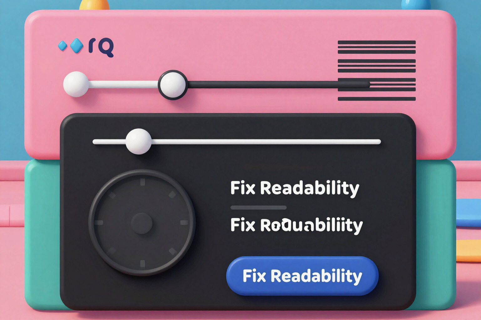
Then you check it with your own eyes. The slider reduces the image from 300 to 60 pixels, the size at which it appears in your library. It is not a mockup with a sample image: it is your cover, truly reduced.
And if the traffic-light is not green, the Fix readability button appears, which recomposes the piece over the art that is already saved: it puts a box behind the text and, depending on the measured reason, changes to a thicker stroke typography or trims the title to the first three words. It does not regenerate art with artificial intelligence, so it does not waste generations, and when finished, the three measurements are repeated on the new file.
Try Measured thumbnail test right here
Use it free without an account. If you want to save your result, you can sign up afterwards.
Save / Sign upBenefits of Measured thumbnail test
Measured verdict, not given by eye
the contrast is calculated over the actual region of the title in the final exported image, with the measured luminance expressed as a ratio. The number is shown to you alongside the traffic-light (for example, contrast 5.2:1) and it decides the color.
Three independent measurements
contrast under the title, stroke weight projected at 60 pixels, and word count. A title can have plenty of contrast and still fail because the font is too thin when reduced, or because there are seven words where three fit.
Public and versioned thresholds
4.5:1 minimum contrast, 3.0:1 as the red boundary, 0.96 pixels of projected stroke weight, and five words for the title. These are the values from the app's specification sheet, not a criterion that changes day by day.
Check with your own eyes
the slider takes your cover art from 300 to 60 pixels. What you see reduced is the file you are going to upload, not an invented preview.
Free fix without regenerating art
the Fix Legibility button recomposes over the already saved art. Box behind the text, thicker stroke typography if the issue was the stroke, or title trimmed to three words if there were too many. Zero artificial intelligence generations consumed.
Re-measure after the fix
the recomposition is not accepted as good on its own. When saving the new file, the three measurements are repeated and the traffic-light verdict is updated, so you see if the fix really worked.
The traffic-light verdict is the last check, not the only one
when composing the cover art, if the measured contrast does not reach 4.5:1 and the treatment is set to automatic, the app raises a level —shadow, border, box— and re-composes before delivering the image to you.
In playlist covers and podcast covers
the test accompanies pieces with text of 1000 × 1000 pixels and the podcast master of 3000 × 3000, and in both cases projects the stroke to the same 60 pixels, because that is the size at which it is decided if your title is readable.
Check the traffic-light verdict before uploading the cover art, not after
Exploring styles, simulators, and the specification sheet is free and requires no registration; generating the cover art with artificial intelligence and recomposing it requires a free account, no credit card needed. AI tools for Spotify is the app from AiToolsForApps that measures the contrast, stroke weight, and title words of your cover art and recomposes it without wasting generations; it is available at https://aitoolsforapps.com/spotify-playlist-covers-names-and-descriptions-222. It is not affiliated with Spotify and does not connect with your account: it produces files that you upload.
In the features that use AI, responses are generated by artificial intelligence and are not a substitute for professional advice.