Canva
Instagram Dimensions 2026: the feed changes to 3:4 and how to reframe your pieces without losing text or faces
Team at AiToolsForAppsWritten with AI assistance14 min readIn summary
- The Instagram feed now prioritizes 3:4 (1080 x 1440 px), not the classic 4:5 (1080 x 1350 px), which is still accepted but is no longer the reference format (Tiendanube, updated on September 16, 2026).
- The reason is the profile grid: since early 2025, thumbnails are vertical 3:4, so 3:4 is the only ratio that fits completely without cropping (Creative for More).
- Stories and Reels have not changed: 1080 x 1920 px (9:16). What changes is the Reel cover in the feed, which is served at 1080 x 1440 px (Tiendanube).
- Safe zones are the real problem: in a Reel, the interface eats about 14% from the top, 35% from the bottom, and 6% from each side, leaving a usable area of about 950 x 980 px (Zeely).
- Almost never put black bars: extending the edge preserves visible surface and prevents the grid cropping from leaving a blank strip in the profile.
If you publish your own pieces —as a small business, freelancer, or community manager without a designer behind you— 2026 has left you with a whole file poorly framed: everything you prepared at 1080 x 1350 px is now cropped in the grid and falls short in the viewer. This article reviews the current measurements piece by piece, where the interface covers, and how to reframe without losing text or faces. For the mechanical part —getting the same original in various sizes and checking the result— you have the Canva tools from AiToolsForApps, which include presets with safe zones and image sizes for Instagram and measure the final file instead of relying on what the editor says.
What has changed exactly in the Instagram feed?
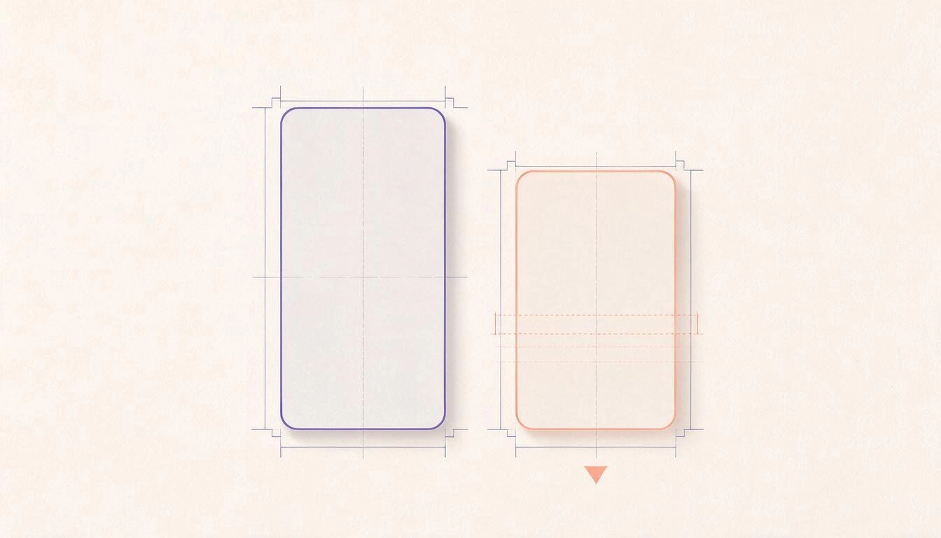
The vertical format that Instagram prioritizes in the feed has changed from 4:5 (1080 x 1350 px) to 3:4 (1080 x 1440 px): 90 pixels taller with the same width. The 4:5 has not disappeared or been rejected, but it is no longer the reference ratio, and a piece framed for 4:5 falls short in the viewer and gets cropped from the top and bottom in the profile grid (Tiendanube, September 16, 2026).
The 3:4 is also the vertical limit of the platform: Instagram accepts photos in any proportion between 1.91:1 (landscape) and 3:4 (vertical) at 1080 px wide, so the usable height ranges from 566 to 1440 px. Above 1440 px high, there is nothing to gain: cropping is inevitable.
What needs to be retained is that the change is not aesthetic, it is framing. If your template has the headline stuck to the top edge and the logo stuck to the bottom, those two elements are exactly what travels to the cropping zone.
The current Instagram measurements in 2026, piece by piece
These are the measurements to work with today. All start from 1080 px wide, which is the actual width at which Instagram stores uploads from the app.
| Piece | Measurement in pixels | Ratio | Note |
|---|---|---|---|
| Vertical feed (priority) | 1080 x 1440 | 3:4 | Fits completely in the profile grid |
| Classic vertical feed | 1080 x 1350 | 4:5 | Still accepted; gets cropped in the grid |
| Square feed | 1080 x 1080 | 1:1 | Appears with padding on the sides in the grid |
| Horizontal feed | 1080 x 608 | 1.91:1 | Minimal surface on screen; not recommended |
| Stories | 1080 x 1920 | 9:16 | No changes |
| Reels (video) | 1080 x 1920 | 9:16 | No changes |
| Reel cover in the feed | 1080 x 1440 | 3:4 | Cropped from the 9:16 of the video |
| Carousel | 1080 x 1440 or 1080 x 1350 | 3:4 or 4:5 | Same ratio in all slides; up to 20 |
| Ultra-wide panoramic Reels | 5120 x 1080 | ≈ 4.74:1 | Must be prepared outside the app |
| Profile picture | 320 x 320 (minimum) | 1:1 | Displays at about 110 x 110 px, in a circle |
| Cover for highlighted Stories | 640 x 640 | 1:1 | Appears cropped in a circle |
Sources: Tiendanube (September 16, 2026), Mind Circus Agency (September 18, 2026) and Creative for More, consulted on November 13, 2026.
For the weight and format, the figures to keep handy: images can be up to 30 MB, although it is reasonable to stay below 1 MB; feed video reaches 650 MB and Reels up to 4 GB, in MP4 or MOV with H.264 video and AAC audio, between 23 and 60 fps and never below 720p (Mind Circus Agency, September 18, 2026).
Why 3:4 and not 4:5? Because the profile grid dictates
The reason for the change is not in the feed, it’s in the profile. In early 2025, Instagram replaced the square thumbnails in the grid with vertical 3:4 thumbnails, and since then any 4:5 piece arrives at the profile cropped, while the native support for uploading in 3:4 was completed later (Creative for More).
The practical effect is twofold. A 3:4 piece takes up more height on the screen in the viewer —more surface area, more attention time— and appears whole in the grid, without anyone deciding which part gets cut off. It is the only ratio that meets both criteria at the same time.
There is a nuance that is worth considering before redesigning the template: regarding the eligibility of 3:4 in advertising, the guidelines do not agree. Creative for More describes it as an organic-only format, not promotable, while Tiendanube lists 1080 x 1440 px among the feed ad dimensions. Until that contradiction is clarified in the official documentation, the prudent approach is simple: whatever you are going to promote, prepare it also in 4:5, which no source disputes.
Where does the interface cover? The safe zones in pixels
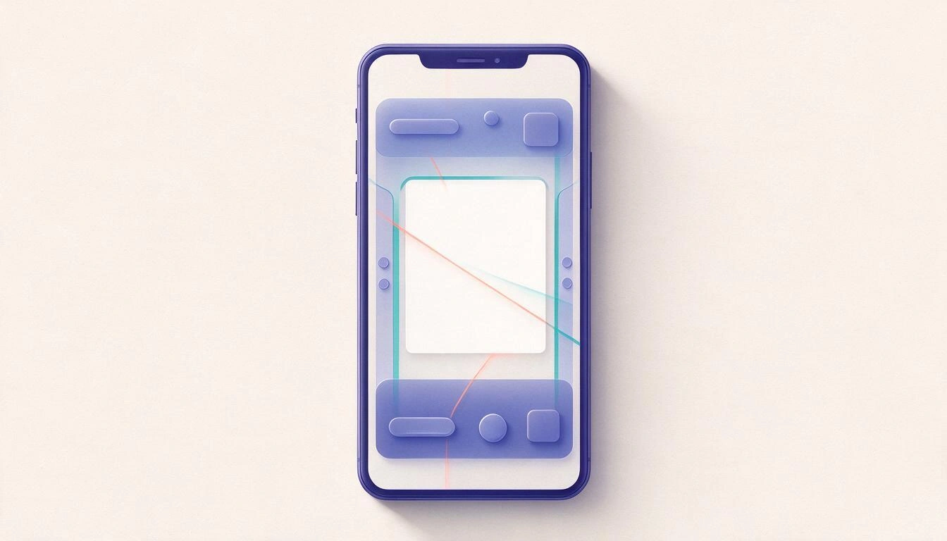
In a canvas of 1080 x 1920 px, the interface of a Reel blocks approximately the top 270 px (14 %), the bottom 670 px (35 %), and about 65 px on each side (6 %), leaving a truly clean area of about 950 x 980 px in the center. In Stories, the bottom blockage is less —around 20 %, about 380 px— and the usable area rises to about 950 x 1270 px (Zeely).
| Piece | Canvas | Top Blockage | Bottom Blockage | Sides | Approx. Usable Area |
|---|---|---|---|---|---|
| Reel (organic) | 1080 x 1920 | ~270 px (14 %) | ~670 px (35 %) | ~65 px (6 %) | 950 x 980 px |
| Story (organic) | 1080 x 1920 | ~270 px (14 %) | ~380 px (20 %) | ~65 px (6 %) | 950 x 1270 px |
| Story with ad and CTA | 1080 x 1920 | ~270 px (14 %) | +~290 px extra | ~65 px (6 %) | Less than the previous one |
| Reel in the grid | 1080 x 1920 → 1080 x 1440 | ~240 px cropped | ~240 px cropped | — | Center 1080 x 1440 px |
Two warnings about this table. The first: estimates vary by source —Mind Circus Agency mentions avoiding critical text only in the top and bottom 250 px—, so if you want a margin that withstands any version of the app, use the most conservative figure, that of the 35 % lower. The second: in March 2026, Meta unified the specifications for Stories and Reels of Instagram and Facebook into a single definition by percentages instead of fixed pixels, precisely so that the same margin would apply to any resolution (Zeely).
The panoramic 5120 x 1080: what it is and when it’s not suitable
Since late September 2025, Instagram accepts Reels in an ultra-wide band of 5120 x 1080 px, the format that became popular as thinnest video: an extremely narrow cinematic band surrounded by black in the vertical viewer (Meet Edgar). It remains open in 2026 and continues to attract attention by contrast, precisely because almost no one uses it.
It’s important to be precise with the ratio, because here the guides are mistaken: 5120 divided by 1080 is ≈ 4.74:1, not the "32:9" or "5.9:1" that several tutorials repeat. If you set up the canvas by the name of the ratio instead of by the two numbers, it will come out wrong.
The limitations weigh more than the novelty. The app’s own editor does not offer this framing —only the classic 4:5, 1:1, 16:9, and 9:16— so you have to prepare the file in an external tool; small text is unreadable in such a narrow band; and low-quality material stands out, because the cropping leaves very few pixels in height (Meet Edgar). Use it for a cinematic shot, a timelapse, or a real panorama; don’t use it for anything that needs to be read, nor for content that will support a campaign.
Black bars or extended border? Almost always extended border
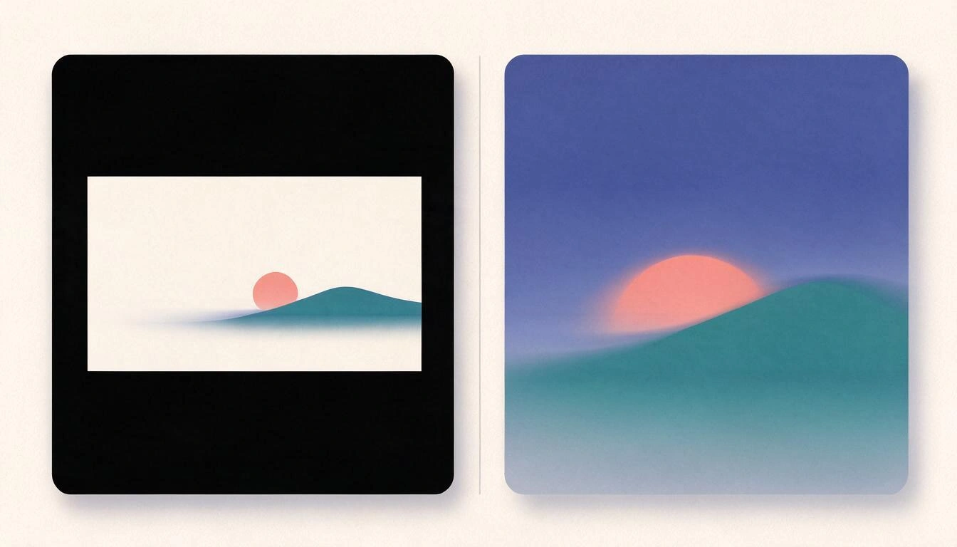
When an original does not cover the target ratio, you have two options: add solid bars to fill the canvas, or extend the border of the image to the edges. On Instagram, the extended border almost always wins, because the bars are not neutral: the grid cropping can land right on them and leave you with a half-empty thumbnail in the profile.
Bars have one unique area where they are the correct option: when the black band is part of the language of the piece, such as in the ultra-wide panorama, where black is the desired effect. Outside of that, extending the border —blurring and stretching the content itself to the edge— preserves visible surface area and holds up better to any subsequent cropping.
And there is a third path that is often the best of the three: reframing thoughtfully instead of filling. If the original is 4:5 and the target is 3:4, a 90 px difference is almost always absorbed by moving the point of interest and readjusting the text, without filling anything.
How to reframe the file you already have in 4:5
Order matters: first decide what cannot be lost, then reposition, and only at the end fill in if there's no other option. With 4:5 to 3:4 the difference is 90 px in height, so in most pieces it is enough to relocate.
- Mark the untouchable. Faces, headline, and logo. If any of that is less than 150 px from an edge, it will suffer in some destination.
- Recenter on the new canvas of 1080 x 1440 px. Do not scale the image to fit: enlarge it and reposition the point of interest within the usable area.
- Return the text to the center. Everything that needs to be read, within the safe zone: in a piece that will also go to Reel or Story, within that central rectangle of about 950 x 980 px.
- Extract the variants you need. Feed 3:4, Story/Reel 9:16, and if the piece is going to be promoted, also 4:5.
- Check the resulting file, not the preview.
Why you need to check the width and weight by re-reading the file
Because the editor tells you what you asked for, not what it wrote. A canvas set to 1080 x 1440 px can be exported with a different width due to a scaling or density adjustment, and the final weight depends on compression, so the only reliable thing is to reopen the exported file and check its dimensions and its actual bytes.
This is not paranoia: it is the reason why a piece arrives blurry on Instagram. If you upload something with a width different from 1080 px, the platform rescales it before recompressing it, and the rescaling adds to the compression. And if the weight shoots well above one megabyte, the compression that Instagram applies is more aggressive, causing the gradient or fine text that you cared for so much to get messy.
The honest check is always the same: open the file, read its width and height, read its size in bytes and, if it does not match the target, export again adjusting the quality until hitting the number. This is exactly the work that Canva tools from AiToolsForApps save: 15 presets spread across 9 destinations, with safe zones for Reels, Stories, TikTok, Shorts, and Instagram grid, four fill modes —including extending the edge—, and a weight target adjustment by bisection of up to eight passes that re-reads the binary on each pass instead of estimating it. Output in JPG or PNG, no watermark, and batches of up to eight sizes of the same original.
Common mistakes when adapting pieces
The most expensive mistake is not getting the size wrong, it is assuming a frame is good without seeing it in its destination. This is the short list of what breaks the most:
- Reusing the 4:5 template as is and discovering the crop when it is already published on the profile.
- Placing the headline in the first 270 px of a Story or Reel, where it is covered by the interface.
- Mixing ratios within a carousel: the same ratio must be maintained across all slides.
- Uploading with a width different from 1080 px, which forces an additional rescaling.
- Filling with bars for convenience instead of recentering or extending the edge.
- Trusting the editor's preview and not re-reading the exported file.
Frequently asked questions
How big is an Instagram post in 2026?
The priority vertical format of the feed measures 1080 x 1440 px (3:4). The classic vertical of 1080 x 1350 px (4:5) is still accepted, as well as the square of 1080 x 1080 px and the horizontal of 1080 x 608 px (Tiendanube, September 16, 2026).
Do I have to redo all my 4:5 templates?
Not all, but yes those that have text or faces close to the edges. The 4:5 publishes without issue; what happens is that in the profile grid it gets cropped and in the viewer it takes up less height, so the template that you have stuck to the margins is the one that needs to be redone first.
What happens if I upload an image taller than 3:4?
It gets cropped. Instagram accepts between 1.91:1 and 3:4 at 1080 px wide, meaning a maximum height of 1440 px; above that the platform decides what part stays out.
How much should an image weigh for Instagram?
The technical limit is 30 MB, but it is recommended to stay below 1 MB so that the platform's recompression does not degrade the quality (Mind Circus Agency, September 18, 2026).
Where is the safe zone of a Reel?
In the center. With a canvas of 1080 x 1920 px, leave about 270 px free at the top, about 670 px at the bottom, and about 65 px on each side: critical text must fit within a central rectangle of around 950 x 980 px (Zeely).
Can I promote a piece in 3:4 as an ad?
Here the sources do not agree: some guides describe 3:4 as a format only for organic content and others list it among the feed ad sizes. The safe bet is to prepare any piece that is going to be promoted in 4:5.
Is the ultra-wide format of 5120 x 1080 useful?
It is useful for showcasing cinematic material, panoramas, or timelapses, and has been available since late September 2025. It is not suitable for pieces with text, and it must be assembled outside the app because the native editor does not offer that framing (Meet Edgar).
How do I check that the file has come out with the correct size?
By opening the exported file and reading its dimensions and size in bytes, never the editor's preview. If the width is not exactly 1080 px or the weight goes above what was expected, it needs to be exported again.
Have the numbers before opening the editor
The change to 3:4 is little in pixels and a lot in work: it forces you to review the templates, to rearrange the text within the safe zones, and to produce each piece in various sizes. That part is not resolved with better taste; it is resolved with numbers: the exact width, the exact weight, and the exact margin that the interface covers. The tools from Canva of AiToolsForApps are just that —measure and safe zone presets for Instagram with the weight verified by re-reading the file—, they work without registration and without installing anything, and what they produce is uploaded to the editor you already use.
Create your piece in 3:4 with the tested size and weight, for free and without registration
Create your piece in 3:4 with the tested size and weight, for free and without registrationKeep reading
View all articles →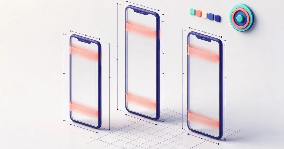
AI-generated images for social media: the dimensions, weight, and contrast to check before publishing
Broken Geode in Geometry Dash 2.2091: which mods are not working and how to keep creating
DLS 27 in December 2026: what is confirmed, what is not, and what happens to your club, your squad and your kits when you update