X (Twitter)
Carousels on X: dimensions and crops for 20 images per post
Team at AiToolsForAppsWritten with AI assistance14 min readIn summary
- X went from 4 to 20 photos or videos per post on November 12, 2026, announced by Jonah Katz, mobile engineering lead of the platform: "After 10 years of Twitter/X supporting up to 4 Photos and Videos per post, the limit has been increased to 20!" (Tesla North, 9to5Mac, Infobae, Nov 12, 2026).
- The sliding carousel is not new: it replaced the 2×2 grid throughout 2026 (first on iOS, in April) and carousel posts now appear in the Multimedia tab of the X search (SocialBee, compiled on Nov 9, 2026).
- X does not publish official pixel measurements for static images or carousel crops (Oakgen, Oct 22, 2026): everything circulating as "carousel measurement" is third-party testing, not documentation.
- In published tests, 4:5 (1080×1350) holds up better than 16:9: the horizontal format loses sides within the carousel frame (kotsun's test on note.com). Hootsuite, on the other hand, continues to recommend 16:9 or 1:1 for the classic post (size guide, Nov 2026).
- Being able to include 20 does not mean it is advisable: the first piece dictates the sliding, and the structures that work remain short (hook, two or three ideas, closing).
If you post on X and design your own cards, November 12, 2026 changed your work: the historic limit of four files per post was quintupled and what used to be a collage is now a carousel that slides with a finger. This article is a practical review of what we know —and what we don’t— about how that carousel behaves: which ratios survive the preview, why the first image dominates, how many pieces make sense to assemble, and how to avoid your card text getting cut off on mobile. For the production part, the X (Twitter) app from AiToolsForApps serves as a recurring example, as it generates its quote cards exactly in the two ratios that are under discussion: you have the details on their page of AI tools for header, bio, threads, and quotes on X.
How many images does a post on X allow now?
Twenty. On November 12, 2026, X raised the limit from 4 to 20 multimedia files per post, and the count is combined for photos and videos: you can mix them within the same twenty. It was announced by Jonah Katz, mobile engineering lead of X, accompanying the message with a gallery of twenty landscape photographs to demonstrate it (Tesla North, Infobae, Nov 12, 2026).
Two important nuances, because the sources from that day do not entirely agree:
- You need to update the app. Both Tesla North and 9to5Mac insist that on iOS and Android the expanded limit requires the latest version of the application; it is not a purely server-side change.
- The web is unclear. 9to5Mac stated on the same November 12 that the change was already active on the web, while Tesla North gave the availability of the web composer as unconfirmed. If you are working from a desktop, check it on your own account before preparing a series of twenty.
No requirement for a Premium subscription for the expanded limit was mentioned in the coverage of the announcement.
The carousel didn't arrive with the limit: it had been rolling for half a year
The sliding format predates the limit change, and that's why there is already accumulated experience. According to the update timeline of X maintained by SocialBee, the carousel first appeared on iOS for posts with two or more images and gradually spread over the summer until it completely displaced the old four-grid.
| Date | Change | Source |
|---|---|---|
| April 2026 | X shows posts with 2 or more images or clips in carousel format on iOS | SocialBee |
| June 2026 | The "carousel style" is rolled out to more users | SocialBee |
| July 2026 | Carousel posts start appearing in the Multimedia tab of the X search | SocialBee |
| October 2026 | Industry guides continue to document the maximum of 4 images and the lack of official measures | Oakgen |
| November 12, 2026 | The limit increases from 4 to 20 photos or videos per post | Tesla North |
That step through the Multimedia tab of the search is what most changes the calculation of social SEO: a card that previously only lived in your followers' feed can now appear as a visual result of a search within the platform. And in a search mosaic, the post's text does not accompany you: what is seen is the crop of the first image.
It is also advisable not to rely on third-party documentation published before November 12. Reference pages like Oakgen (Oct 22, 2026) or the Spanish comparison from AI Carousels still describe the cap of four files and recommend splitting long series into threads. The format recommendation remains useful; the number of slides does not.
What ratio survives the preview: 16:9 or 4:5?
In the published tests, 4:5 (1080×1350 px) wins. The frame of the carousel is taller than it is wide, so a horizontal 16:9 piece looks small and loses information on the sides, while the vertical occupies the screen and allows for more content density. This is the conclusion of the kotsun comparative test, which mounted the same carousel in four different ratios: 9:16, 1:1, 4:5, and 16:9.
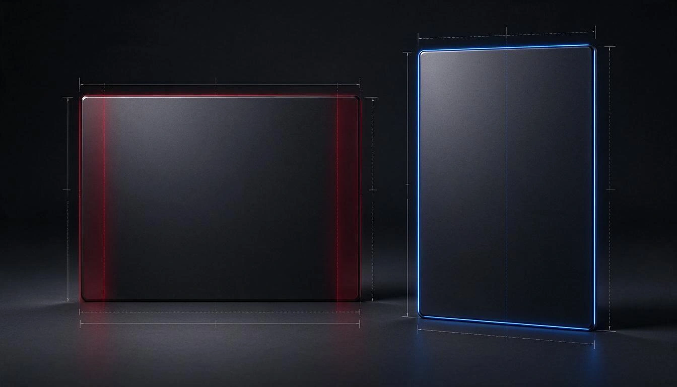
| Ratio | Typical size | Observed behavior | Purpose |
|---|---|---|---|
| 4:5 | 1080×1350 | Good balance between screen occupancy and information density; it is the recommended option from the test | Cards with text, explanatory series |
| 1:1 | 1080×1080 | Vertical/horizontal balance and maximum compatibility across networks | Product, comparisons, multi-channel reuse |
| 9:16 | 1080×1920 | Much vertical occupancy, ideal for tall subjects | Fashion, characters, sequential storytelling |
| 16:9 | 1920×1080 | Cropped from the sides within the carousel | Video and pieces outside the carousel |
Source for the behavior column: kotsun test on note.com.
Now, the honest counterpoint: general guides still recommend the opposite for the normal post. Hootsuite, in its size guide updated to November 2026, lists publication sizes as 1280×720 (horizontal), 720×1280 (vertical), and 1080×1080 (square), and states that "16:9 or 1:1" is the recommended aspect ratio. This is not a contradiction: one thing is the standalone image of a tweet and another is the series within a carousel. If you post a single image, 16:9 remains safe; if you post a series, the vertical performs better.
There is also a classic rule that is worth remembering because it explains a lot about cropping: on X, a single photo with an aspect ratio of approximately between 2:1 and 3:4 is shown complete in the preview, and outside that margin, cropping occurs (AI Carousels). 4:5 (equivalent to 0.8) falls within that range; 9:16 does not.
Why does the first image decide the click?
Because in a carousel the first piece is the only thing that is seen without interacting: it is the thumbnail of the feed, the one that appears in the mosaic of the Multimedia tab and the one that the reader judges in half a second to decide whether to swipe. Kotsun's test presents it as a shift in mindset: you no longer design four images as a single visual unit, you design a story in slides where the first must invite swiping.
Practical consequences:
- The cover is not an ornament, it is the headline. If your series has a figure, a before/after, or a strong statement, it goes on the first card.
- Don’t waste the first slide introducing yourself. The visual "opening thread" —logo, name, "today I bring you"— is exactly what the reader skips.
- Repeat the ratio throughout the series. If the first is vertical and the second horizontal, the height jump is noticeable when swiping and breaks the reading.
- Take care of the alternative text. The shift from grid to carousel already generated confusion in 2026 about how ALT is displayed in the new format; it is the only text that accompanies each piece individually, and it is what makes your series accessible and readable.
How many pieces should be placed against the new maximum of 20?
Fewer than can fit. The maximum is technical, not editorial: the structures that work on X remain short, on the order of four to six cards, with an initial hook, one idea per slide, and a closing. The carousel guide from Supaslides still proposes the classic scheme of four —slide 1 hook, 2 and 3 one idea each, 4 punchline or call to action— and that skeleton remains valid because the limit has increased.
Use it as a decision criterion:
- 2-3 pieces: comparisons, before/after, data + source.
- 4-6 pieces: step-by-step explanation, what you previously split into two publications of four.
- 8-12 pieces: photo report, catalog, event gallery. Here the value is in the volume, not in the ordered reading.
- 20 pieces: only if each image stands alone. Twenty text cards are not read; twenty photos from a trip are.
The real benefit of the increase is more prosaic and more valuable: it no longer makes sense to split a series into threads of four. That was the workaround recommended by all guides until October 2026, and it was bad because it spread the reach across several posts.
How to prepare a series of cards without cutting off text on mobile
The only reliable defense is to leave a safety margin and center the text, because X cuts multimedia previews on the timeline and does not document how much. The explicit recommendation from the guide of Oakgen (Oct 22, 2026) is to keep important content centered precisely for that reason.
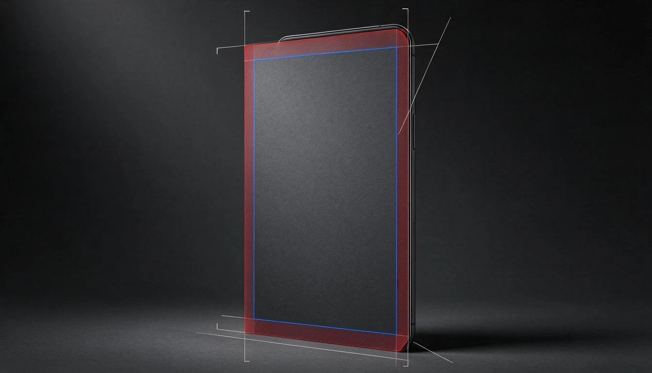
Checklist before uploading a series:
- A single ratio for the entire series, preferably 4:5 (1080×1350) if they have text.
- Generous inner margin: no text stuck to the edge; if in doubt, leave at least 8-10% of the side as air.
- Few lines and large. A vertical card can hold more lines than a horizontal one, but the real limit is legibility on a phone screen, not space.
- Weight and format within the accepted limits: GIF, JPG, and PNG, with up to 5 MB on mobile and 15 MB on the web, according to the Hootsuite size guide (Nov 2026). Other references add WEBP and set 5 MB per image (AI Carousels).
- Test with a real post before the good series. It’s the only way to know how your version of the app cuts.
This is where a production tool saves repetitive work. The X (Twitter) app from AiToolsForApps generates its quote cards in the two ratios of the debate —1920×1080 (16:9) and 1080×1350 (4:5)— with a different template and file for each format, and with a limit of lines per ratio (four lines horizontally, seven vertically) just so the text does not overflow; it also exports in PNG, without a watermark, and re-reads the generated file to check that it measures and weighs what it should before approving it. The attribution —name, @username, and circular photo— is composed on top, and there are four graphic themes to keep the series coherent. It’s on its page of templates and sizes for quote cards on X and can be tried without registering.
What measures are verified and which are not
This is the uncomfortable part: X does not publish carousel crop sizes. There is no official pixel documentation for still images (Oakgen, Oct 22, 2026), so any exact measurement of the "carousel safe zone" you find out there is third-party measurement or an estimate. This is the frontier, as it stands today:
| Data | Status | Source |
|---|---|---|
| Limit of 20 photos/videos per post | Confirmed by the platform | Jonah Katz announcement, Nov 12, 2026 |
| Combined count of photos and videos | Confirmed in the announcement coverage | Tesla North |
| Formats and maximum size (JPG/PNG/GIF; 5 MB mobile, 15 MB web) | Documented by industry guides | Hootsuite, Nov 2026 |
| Profile picture 400×400 and header 1500×500 | Documented and established for years | Hootsuite, Nov 2026 |
| 16:9 side crop within the carousel | Observed in tests, without official confirmation | kotsun on note.com |
| Range of 2:1 to 3:4 shown fully | Industry convention, without official document | AI Carousels |
| Exact pixels of the carousel safe zone | Unverified: no public measurement | — |
| Availability of the 20 limit in the web composer | In dispute among sources from Nov 12, 2026 | 9to5Mac vs Tesla North |
The work consequence is simple: treat all carousel geometry as provisional, document where you got each number from, and re-measure it when the app changes. In the AiToolsForApps app, this is assumed out of the box: the measures of X that have not been verified on a real device are marked as unverified on screen, instead of being presented as official.
Frequently Asked Questions about X's carousel
How many photos can I upload in a tweet in 2026?
Up to 20 photos or videos in the same post, counting both types together, since November 12, 2026. Before, the limit was 4, and it hadn't changed in a decade.
What size is best for a carousel on X?
If the cards have text, 1080×1350 px (4:5) is the size that yields the best results in published tests. 1080×1080 (1:1) is the safest option if you are going to reuse the same piece on other networks.
Why are my images cropped in X's carousel?
Because the carousel frame is taller than it is wide, and X adjusts the preview to the frame: horizontal pieces lose sides. X does not publish the exact crop, so the recommendation is to leave margin and center what's important.
Do I need X Premium to post 20 images?
The announcements from November 12, 2026, did not mention any subscription requirement. What is needed on mobile is to have the app updated.
Does it still make sense to split a carousel into a thread of multiple posts?
For series of up to 20 pieces, no longer: before they were split into tweets of four because they wouldn't fit, and that spread the reach. Threads are still useful when what you want is long text chained together, not a gallery.
Do carousels appear in X's search?
Yes. Carousel posts appear in the Multimedia tab of X's search, a change documented in the 2026 update timeline from SocialBee. In that mosaic, only the crop of the first image is visible, without the post text.
What size and format does each image support?
GIF, JPG, and PNG, with a maximum of 5 MB from mobile and 15 MB from the web, according to Hootsuite's size guide from November 2026. Some industry references add WEBP.
Produce the series, don’t measure it by eye
X's carousel has stopped being a collage of four to become a narrative format of up to twenty pieces, and it did so without an instruction manual: the measures that really matter —the crop of the frame, the safe zone for text— remain territory of trial and error. As long as that doesn't change, the professional thing is to work in 4:5, leave margin, put the hook on the first card, and note which number is verified and which is not. For the mechanical part —quote cards in 16:9 and 4:5 with their line limits, header 1500×500 with safe zone simulator and preview for mobile and desktop— the X (Twitter) app from AiToolsForApps does that work with the stated measures and marked when they are not verified: enter AI tools for header, bio, threads, and quotes of X and build the series without registering.
Set up your carousel cards in 4:5 and 16:9, with the line limit resolved and a simulated header of 1500×500: try the X (Twitter) app from AiToolsForApps without registering.
Set up your carousel cards in 4:5 and 16:9, with the line limit resolved and a simulated header of 1500×500: try the X (Twitter) app from AiToolsForApps without registering.Keep reading
View all articles →
The X algorithm now reads your words, not your letters: what changes in bios, names, and thread hooks in 2026

Broken Geode in Geometry Dash 2.2091: which mods are not working and how to keep creating

DLS 27 in December 2026: what is confirmed, what is not, and what happens to your club, your squad and your kits when you update